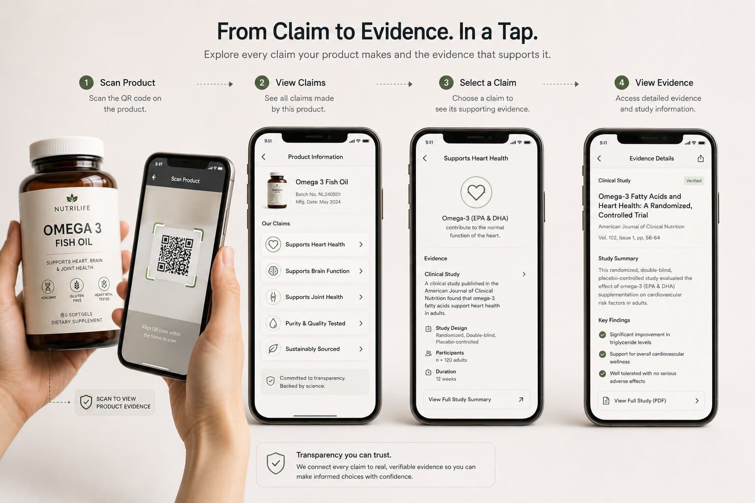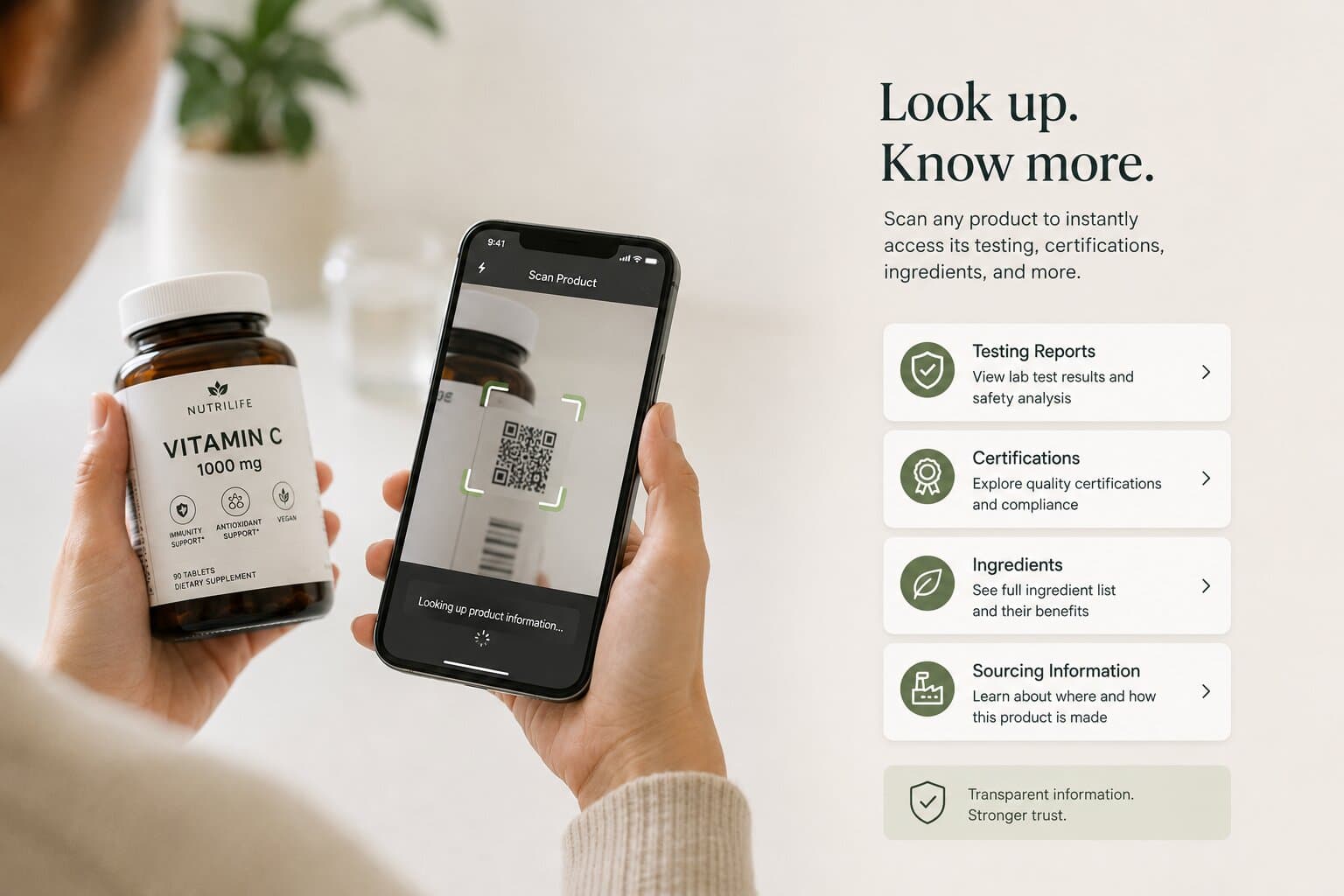
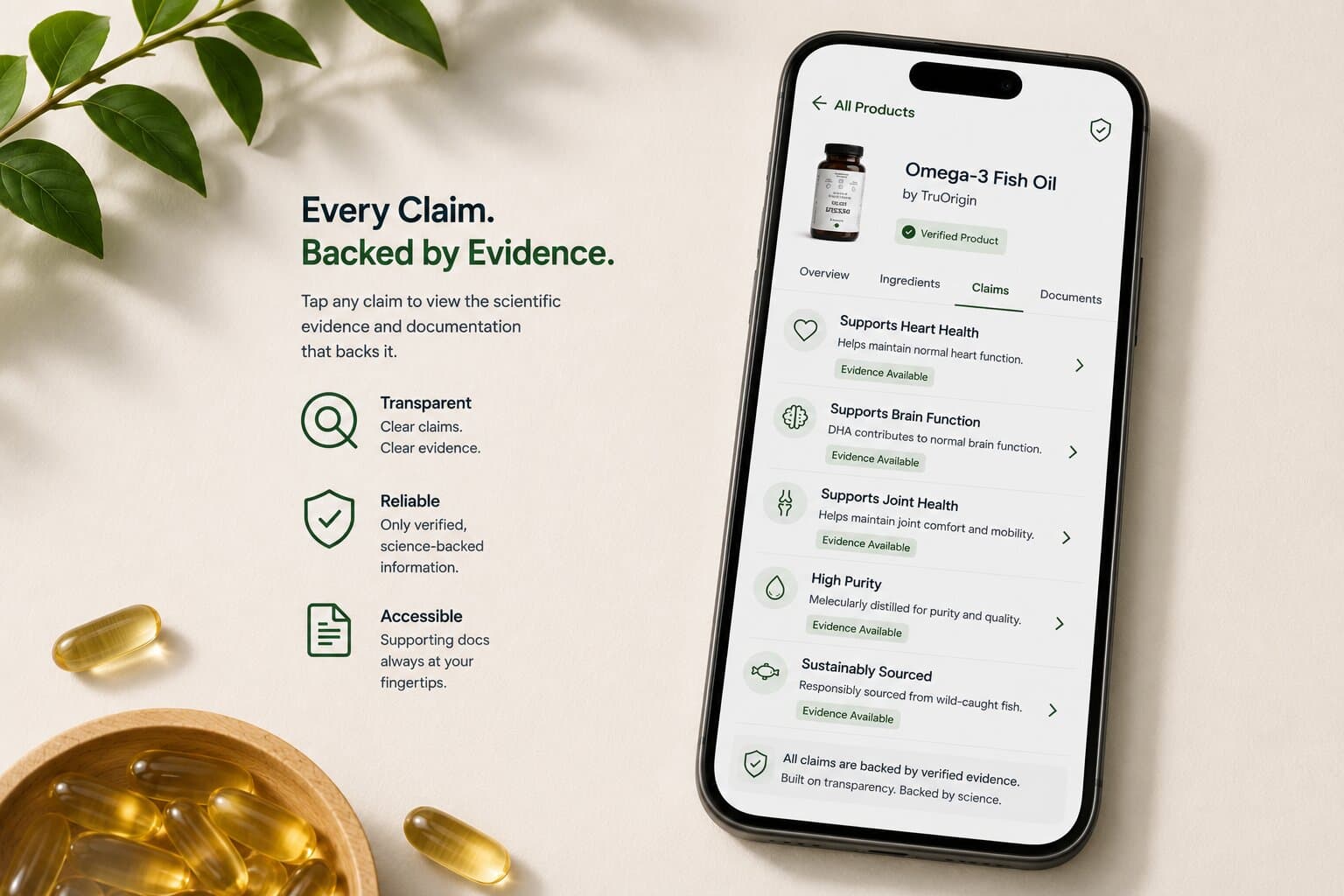
It’s one thing to say a product should be able to "explain itself." It’s another to know what that actually looks like on a screen, the moment someone scans a QR code standing in front of the product. Here’s the concrete version.
The Structure, Claim by Claim
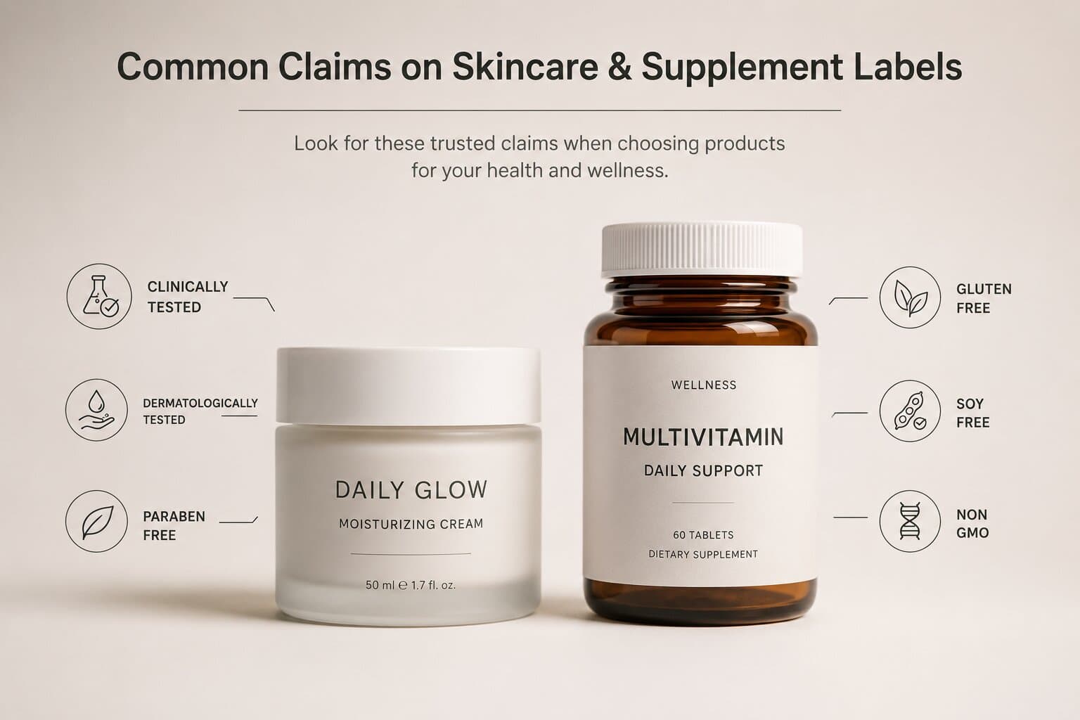
A self-explaining product page doesn’t open with a wall of text. It opens with the same claims already on the packaging: "Clinically Tested," "Third-Party Tested," "Sustainably Sourced," each one presented as something a customer can tap into individually, rather than a paragraph they’d need to read start to finish.
Tapping a claim doesn’t dump a full lab report on the customer either. It surfaces a short, plain-language summary first (what was tested, by whom, and what the result was) with the option to go deeper into the actual documentation for anyone who wants it. This is the same claim-to-evidence structure described more conceptually in What If Every Product Could Explain Itself?.
Built for Two Very Different Customers
Some customers want reassurance in five seconds: a green checkmark, a certification badge, a one-line summary. Others want to actually read the ingredient sourcing notes or the full testing methodology before they feel confident enough to buy it. A self-explaining page has to serve both without forcing either one through the other’s path.
That’s why the structure matters as much as the content: quick answers on the surface, real documentation one tap deeper, for whoever wants it.
What This Replaces
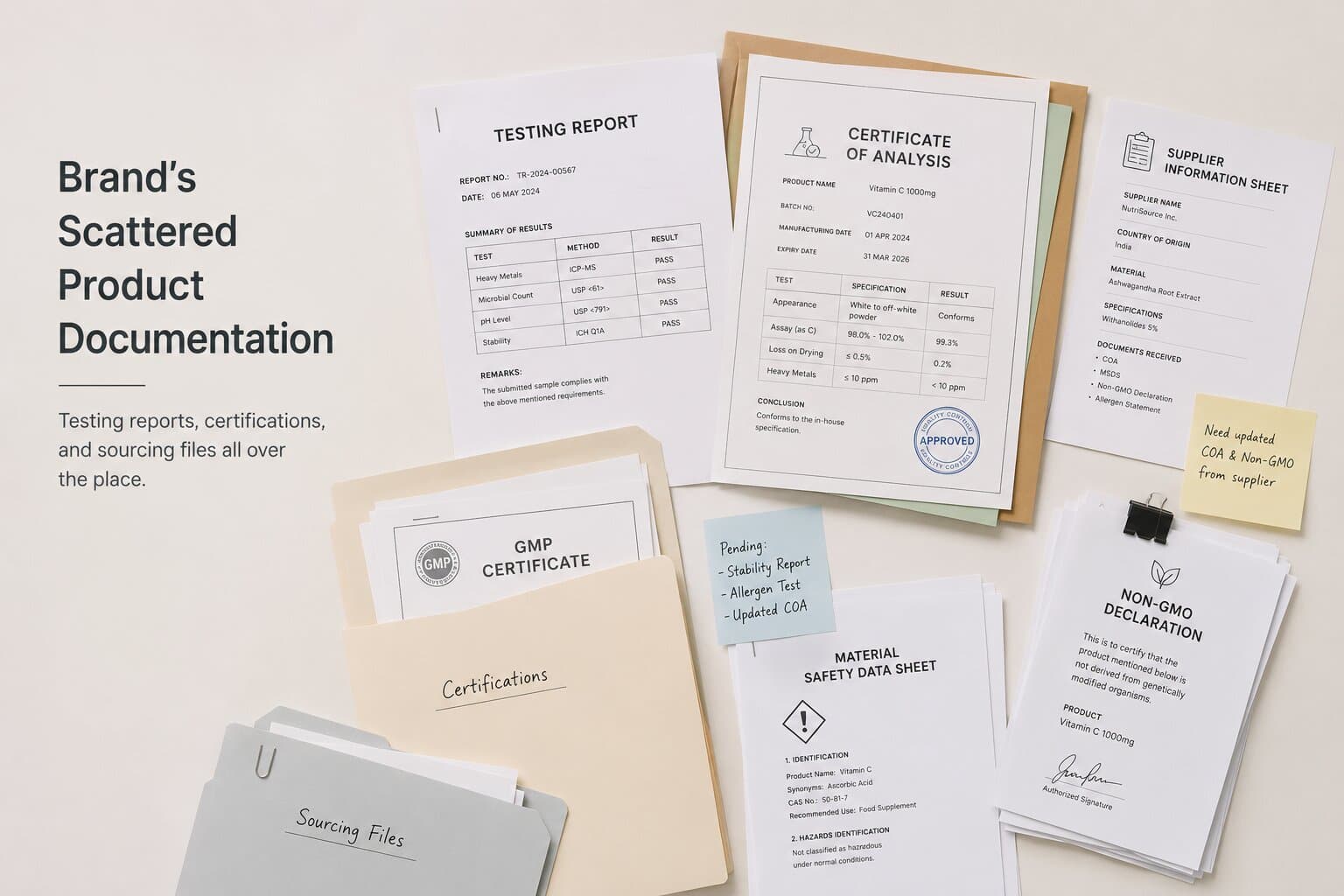
Without this structure, both types of customers are underserved. The five-second shopper gets a wall of text they’ll skip. The deep-diver gets a marketing paragraph with no real evidence behind it. A claim-by-claim, tap-to-expand structure, the model behind OriginCard, solves for both at once, because it doesn’t force a single reading path on every visitor.
Want to see this structure built around your own product's actual claims?
Book a demo →